Sunday, November 4, 2012
Symphonies
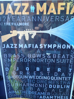
Recently I was walking around Haight Ashbury and I came across this promotional poster for a local show. It struck me as interesting because the typography used in it was simple yet it used space and image placement to make it more eye catching. The combination of stroke weights and letter spacing in between lines makes it much more satisfying to look at. It also used a cool montage that completely makes sense when you read the name of the symphony. Its interesting to see how even though theres a bunch of text on the page, the words that matter the most are the ones set in bold. Therefore, those are the ones that seem to catch your eye first.
Subscribe to:
Post Comments (Atom)

No comments:
Post a Comment