Wednesday, November 28, 2012
Evolution of Ads
Watching Mad Men and coming across a website that compiled some advertisements from the era of which Mad Men is set (1960s), got me thinking about how our advertisements really reflect the social atmosphere of that time. This ad, clearly showing the perceived male dominance of that era, would never have passed in today. Its interesting to know that from looking at an ad, we can identify what the living conditions of that time may be like. Now looking at the layout from a strictly artistic standpoint, I feel that the use of a black and white image rather than color adds to the seductiveness that the woman is trying to portray. I feel that with color, the image would reveal to much to the audience, and what I mean by this is that taking away a sensory object such as color enables the audience to almost "fill in the blanks". In this case, we can imagine her to have a certain shade of hair or tone of skin. To me, this makes the ad more appealing. Adding to this, the font seems to push the sexuality. The text seems to invite while at the same time being assertive. Artistically, this layout is appealing. Morally, not so much.
Gill Sans
Looking at this type specimen featured in the rare book room, my first impression was how simple it was compared to the Helvetica type specimen that we were shown in our project three brief. Upon further looking into it though, I realized that with simplicity, the specimen also has a range of small technical values that make it interesting. I like the fact that the bordering sentences on the edge of the layout is not what attracts your attention first, even though its in red. In addition, I like the contrast of font size as the text in the middle goes down. This layout is something I look at as using the core principles of type to predict its design. Its not too complex which is refreshing in todays world, where more is not enough.
Wednesday, November 21, 2012
Layouts
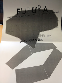
For project three, this is one of my layouts. I intend to add some color to it, but for now its in black and white so I can see if it still looks good. As we were talking in class, a piece should look good in both color and black and white because the color shouldn't make the design, rather it should rely on the core elements of the shapes and lines that you combine to make the piece. With this layout, I tried to make a design that had geometric units because that reflected my typeface(futura) which also uses geometric elements.
Tuesday, November 20, 2012
Type Specimens
While working on our latest type specimen project, I came across a pretty distracting challenge: How to create a piece without going to far away from the principles of the type. I was having trouble using the design of the actual typeface dictate my layout and visual makeup. Rather, I was creating layouts that had images with the typeface as a secondary visual aspect. Looking at type specimens such as this one made me rethink my work. I needed to create something that made the typeface the focal point and let that, in turn, make the design of the page.
Sunday, November 4, 2012
Symphonies
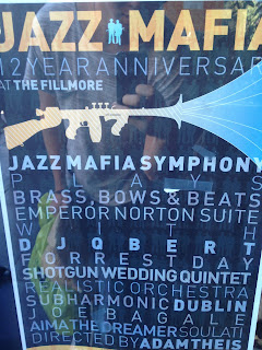
Recently I was walking around Haight Ashbury and I came across this promotional poster for a local show. It struck me as interesting because the typography used in it was simple yet it used space and image placement to make it more eye catching. The combination of stroke weights and letter spacing in between lines makes it much more satisfying to look at. It also used a cool montage that completely makes sense when you read the name of the symphony. Its interesting to see how even though theres a bunch of text on the page, the words that matter the most are the ones set in bold. Therefore, those are the ones that seem to catch your eye first.
Subscribe to:
Comments (Atom)


